Quick Brown Foxes
My eyes aren’t what they used to be. A bog witch hasn’t turned them into tiny owls–they are still eyes. But they are becoming less good at being eyes.
Glasses may be in my future, but for now the issue is text. I can read books or the newspaper (because I’m a thousand) as well as I ever could, so it’s something specific to screen text. I have tried the obvious things to work around it; increasing font size and using dark mode where possible. But both options come with their own problems and annoying edge cases. It helped. A bit.
Then I found a Lobsters thread about the Atkinson Hyperlegible font. Which led me down a rabbit hole of kerning, serifs and unambiguous forms, and a list of fonts to try.

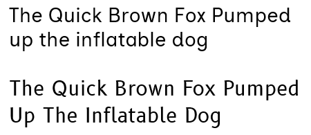
Created in partnership the Braille Institute of America, Atkinson Hyperlegible claims to differ from regular fonts by focusing on letterform distinction. Basically it takes similar characters–think big I and little l–and makes them visually distinct to be more readable. This is the main one I’ve been testing recently.

Inclusive Sans is similar in that it tries to be distinct at a character level, but without appearing out-of-place next to modern fonts. It was also designed in Australia and has support for Aboriginal languages. Very cool. It doesn’t scream accessibility in the way Hyperlegible does. Perhaps that’s desirable? Keeping an eye on this one.
While the other two fonts were designed around accessibility, B612, from Airbus, was built for use on aircraft screens and dials. You don’t want fuzzy eye-tiring text when you’re a short-sighted co-pilot on a week long flight from Australia to…anywhere else. I feel this is the most “normal” of the ones I’ve looked at–the letter characters nothing to write home about, but the numbers are nicely distinctive. I can probably find a place for it.
Other fonts the deserve a quick mention are Andika and the unfairly maligned Comic Sans. Both are supposedly highly regarded by folks with dyslexia and similar conditions. Also monospace fonts in general are designed to offer good readability–when I do what could charitably be called coding, I use Consolas–there are a few with the same legibility focus as the fonts listed here, such as 0xProto.
So I’m spending around a week or ten days with each font, using them in all the easy places (word, firefox, notepad, pdfreader), and choosing which is the most kind to my poor eyes. Then I’ll try figure out how to use that one in all the hard places (basically the entire windows gui).
See you next time.
Current Status
Cat: Ensconced
Writing: Minimal
Hands: Together